
The Mechanics of Inscription: Balancing Detail, Font Size, and Stone Longevity
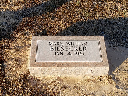
When families begin designing a headstone, much of the initial focus goes into selecting the granite color and choosing the right epitaph. However, one of the most critical structural decisions lies in the mechanics of the lettering itself: font choice, sizing, letter depth, and spatial arrangement.
Lettering on a monument isn't just printed on stone—it is carved into a natural material exposed to decades of South Carolina sun, rain, and temperature swings. Ensuring an inscription remains sharp and legible for generations requires balancing artistic design with technical masonry principles.
At Gillespie Marble & Granite Works, we have carved inscriptions for families across Greenville and the Upstate for over a century. Here is a look at the technical mechanics behind headstone inscriptions and how smart typography choices ensure your memorial stands the test of time.
1. Letter Depth vs. Font Size: Why Sizing Matters
A common design desire is to include an extended poem, a long scripture verse, or detailed family history on the face of a monument. However, fitting extensive text onto a fixed stone surface forces font sizes down—which directly impacts how deeply the letters can be carved.
The Proportion Rule: In sandblasted monument lettering, the width and height of a character dictate how deep the sandblasting stencil can carve into the granite without compromising the integrity of the stone.
The Risk of Small Text: Tiny fonts require shallow cuts. Over time, shallow lettering collects ambient dirt, biological growth, and moisture faster, reducing contrast and making the stone difficult to read.
Optimal Sizing: Primary names are typically cut at 2 to 3 inches in height, dates at 1.25 to 1.5 inches, and epitaphs or quotes kept above 0.75 inches. Keeping text within these structural boundaries allows for deep, crisp carves that stay legible for decades.
2. Font Style Dynamics: Script, Serif, and Sans-Serif
Not all typefaces translate equally onto granite. While a font might look elegant on a computer screen or paper proof, stone crafting requires fonts with bold, solid structural stems.
Serif Fonts (e.g., Roman, Modified Roman): Traditional Roman lettering remains the gold standard in monument carving. The flared ends (serifs) provide high legibility and create distinct shadow lines in daylight.
Sans-Serif Fonts: Clean, modern block letters offer maximum readability from a distance and work exceptionally well on smaller markers or rustic finishes.
Script & Cursive Fonts: Delicate, sweeping script fonts can look beautiful, but extremely thin connecting lines risk chipping during the carving process. If script is preferred, selecting a bold, high-contrast weight ensures the lines carve cleanly.
3. Matching Legacy Markers in Family Plots
One of the most complex inscription tasks occurs when adding a second marker to an existing family plot or adding a final date to a companion headstone decades after the first entry was carved.
Lettering techniques have evolved significantly over the decades—from hand-chiseled lettering in the early 1900s to modern computer-guided sandblasting. Matching a legacy marker requires precise physical rubbing or photographic scaling to replicate:
Font Geometry: Matching unique, non-standard letter proportions crafted by historical masons.
Letter Spacing (Kerning): Mirroring the original layout distance between characters and lines.
Carving Style: Matching V-sunk, flat-bottom, or skin-cut carving depth so the new inscription seamlessly aligns with the existing craftsmanship.
4. Litho Proofing & Contrast Treatments
Because granite color affects how light reflects off carved letters, contrast techniques are often applied to enhance legibility.
Unpainted Carves: On dark, polished granites like Jet Black or Barred Gray, unpainted sandblasted letters create natural contrast by exposing the lighter, unpolished interior of the stone.
Litho Inks: On lighter granites (such as Georgia Gray), a specialized, weather-resistant monument paint—known as litho—is often applied inside the carved lettering. Black, dark gray, or white litho enhances shadow contrast and keeps names readable even in direct sunlight or heavy rain.

5. Experienced Inscription Craftsmanship in Greenville
Designing a lasting headstone layout is a balance of sentiment and structural masonry. Serving Upstate South Carolina since 1897, Gillespie Marble & Granite Works combines historical knowledge with precision equipment to ensure every inscription is cut accurately, built to last, and fully compliant with local cemetery standards.
Need help designing an inscription or matching an existing family headstone?
Contact the team at Gillespie Marble & Granite Works in Greenville today to review font samples, spatial proofs, and custom layout options.


Comments